The new MacBook Neo is easy to notice for its bold colour story, but the real story is that Apple has turned MacBook Neo colours into a practical buying signal. This isn’t just about liking blush, indigo, silver, or citrus on a shelf or in a product photo. It’s about whether the laptop fits your workplace laptop aesthetics, your resale expectations, your desk setup, and the way you want your device to feel every time you open the lid. In the same way that a smart buyer compares battery life, ports, and display specs, colour can now be treated as a serious part of Apple personalization and a subtle but useful part of device ownership. For a wider look at how hands-on coverage informs purchase decisions, see our guide on Apple’s next smart home moves and our practical virtual try-on approach for buying gear online.
In this deep-dive MacBook Neo review and buying guide, we’ll treat colour as a filter, not a flourish. We’ll look at how the Neo’s colour-matched lid, keyboard, feet, wallpaper, highlight colours, and menu accents create a coherent visual system, and then translate that into real buying advice. That means discussing resale value, professional settings, accessory matching, personalization tips, and the kind of subtle tradeoffs that matter once the laptop stops being a showroom object and starts being your daily machine. If you’ve ever wondered whether a bold colour will age well, whether it looks too casual in a client meeting, or whether it can be made to look more premium with the right accessories, this guide is for you. And if you’re also comparing value broadly, our piece on pricing used items smarter is a useful companion read.
1. What Makes MacBook Neo Colours Different from Typical Laptop Finishes
Colour is built into the hardware identity
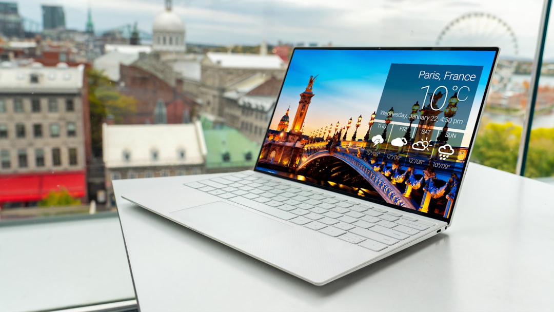
Most laptops treat colour as a shell-level choice: a dark chassis, a silver finish, maybe a playful option if the product team feels adventurous. The MacBook Neo goes further by integrating the colour language across the device. Apple colour-matches the logo, keyboard tint, feet, and even the onboarding experience, which creates a more complete design identity than simply painting the lid. That matters because users don’t experience a laptop as a single surface; they experience it as a set of repeated visual cues that either feel intentional or feel random.
This is why the Neo’s colour personalization is more than aesthetic branding. It affects how premium the device feels when closed, how calm it looks on a desk, and how well it blends into your workflow environment. Apple has long been strong at this kind of detail, much like brands that treat packaging, unboxing, and everyday use as part of the product rather than an afterthought. For more examples of how design language shapes user perception, see symbolic communication in design and curated visual identity approaches.
The Neo’s colours are doing UX work
Colour here is also a user experience cue. The wallpaper, highlight colour, and menu colour change based on the model you choose, which reinforces the device’s identity from the first setup screens onward. That means the laptop is not only a tool but a kind of environment, especially for people who like their devices to feel cohesive with their taste. If you’ve ever changed your phone wallpaper, app icons, or watch face to feel more organized, the Neo extends that logic into laptop ownership. For guidance on broader device tailoring, our article on desktop personalization systems shows why small design cues can affect daily engagement.
Why this matters for buyers
When colour affects the perceived identity of a laptop, it starts to matter in a purchase decision. Buyers aren’t just choosing a machine; they’re choosing how visible the machine will be in meetings, cafes, classrooms, and shared workspaces. A warm blush finish can feel expressive and modern, while indigo may read more serious and cinematic. Citrus, meanwhile, signals confidence and individuality, but it also requires more intentional styling if you want the overall setup to stay professional. That’s why colour should be treated like a buying spec alongside RAM and storage, not as a last-minute preference check.
2. How MacBook Neo Colours Affect Workplace Laptop Aesthetics
Matching the room, not just the mood
Workplace laptop aesthetics are really about fit: fit with your desk, your company culture, your camera framing, and your clothes. In open offices, client-facing spaces, or co-working environments, a laptop that feels too flashy can distract from your work or your presence. The MacBook Neo’s colour options let you choose how much visual emphasis you want your laptop to carry. Silver is the safest if you want a low-drama, broadly professional look, while blush and indigo can still look polished if paired with restrained accessories and a clean workspace.
The trick is to think of the laptop as part of your visual wardrobe. If your day includes video calls, presentations, and face-to-face collaboration, the laptop sits in the same frame as your face and your environment. That means colour can subtly affect how your setup is interpreted, especially by people who are reading into your taste, confidence, or attention to detail. For a parallel lesson in styling gear for real-world use, see our guide to outerwear styling choices and how visual balance changes the whole impression.
Colour intensity and “client-safe” presentation
If you work in law, finance, consulting, education administration, or any role where a laptop is visible in meetings, the safest route is a colour that disappears into the background. But “safe” does not have to mean boring. A well-chosen accessory set — think black or charcoal sleeve, understated mouse, matte cable, and a neutral desk mat — can make even a citrus Neo look considered rather than loud. This is the essence of buying advice for the Neo: the colour is one variable in the total presentation, not the final verdict.
There’s also a psychological side to this. Some users are more productive when their tools feel inspiring, while others prefer visual quiet. If your laptop becomes a daily morale boost, that may be worth more than a conservative finish. If you want to build that kind of personal system around your gear, our article on micro-rituals for busy days offers a useful framework for making small choices that improve consistency and comfort.
What to choose if you share workspaces
Shared desks and hybrid offices make aesthetics more important than people often admit. A bright laptop can stand out on a communal table, which can be good if you want your gear to be unmistakably yours, but less ideal if you want to blend into a mixed professional setting. In those cases, the best Neo colour is the one that can be dressed up or down with minimal effort. Silver is the easiest to adapt, indigo is the most versatile for a premium look, and blush works best when paired with matching or monochrome accessories. The practical lesson is simple: choose the colour that minimizes the number of items you’ll need to “fix” the look later.
3. Resale Value: The Hidden Financial Side of MacBook Neo Colours
Colour can influence demand, even when specs are identical
When people search for laptop resale value, they usually focus on battery health, storage, screen condition, and warranty status. Those are important, but colour can influence how quickly a listing sells and who is likely to buy it. Neutral finishes generally appeal to the broadest audience, which is why silver or classic light metallic tones often have the strongest mainstream resale profile. Bolder colours can still sell well, but they may narrow the buyer pool to people specifically looking for that aesthetic.
This does not automatically mean a bright Neo will lose value. In some markets, distinctive colours can command stronger interest if they are scarce, trend-aligned, or especially desirable within a certain audience. The key is liquidity: how quickly and easily the device can be sold when you’re done with it. If you like to upgrade often, a colour with broader appeal may be the smarter financial play. If you keep devices for years, personal satisfaction may outweigh any resale premium. For broader resale strategy thinking, see our guide on choosing used tech strategically and our piece on resale market discipline.
Condition visibility and cosmetic wear
Different colours age differently in appearance, even if the actual materials are the same. Lighter finishes can make fingerprints, scuffs, and edge wear more visible, while deeper colours can show scratches more sharply under direct light. That means the most “forgiving” colour is not always the one you love most, and that matters if you plan to sell the machine later. Buyers often interpret visible wear as a sign of rough use, even when the underlying electronics are fine.
There’s another practical issue: accessories and decals can leave marks over time. A transparent shell, sticker-heavy lid, or repeated use of rubbing alcohol can affect finish consistency and reduce resale appeal. If resale matters to you, keep the laptop visually clean and avoid long-term modifications that are hard to reverse. Our article on recycling and rehoming office tech is a good reminder that a well-maintained device retains more optionality.
Best colour choice if resale is a priority
If you’re treating the Neo like a three-year lease without the lease, silver is the conservative resale choice because it has the widest market appeal and the least chance of looking trendy in a way that dates quickly. Indigo may appeal to buyers who want something premium and slightly expressive, while citrus and blush are more taste-driven. In practical terms, the best resale strategy is to choose the colour you can live with for the full ownership cycle, then protect the finish with careful handling rather than relying on the market to reward uniqueness. Buyers pay for condition first and colour second — but colour does shape the speed of the sale.
4. How to Personalize the Neo Without Making It Look Messy
Use software to reinforce, not overwhelm
Apple personalization works best when it creates consistency. The Neo’s wallpaper, highlight colours, and menu tones are meant to complement the hardware, but you can absolutely tone them down or build around them. If you prefer a polished look, start by matching your desktop wallpaper to the laptop finish in a subtler way: muted gradients, neutral photography, or abstract textures that echo the case colour without screaming it. The goal is to create a visual rhythm, not a theme park.
Think of it like editing a presentation. Too much colour makes the message feel chaotic, while just enough colour helps important elements stand out. If you’re using the Neo for work, keep high-saturation themes to a minimum and save the bolder settings for personal profiles or focus modes. This approach mirrors good software hygiene in general, where customization should support clarity. If you care about workflow design, our guide to managing software sprawl offers a useful mindset for reducing clutter.
Make the keyboard and wallpaper feel intentional
One of the most impressive parts of the Neo design is that the keyboard is lightly tuned to the chassis colour, which makes the whole system feel more unified. That’s great — but only if the rest of your setup doesn’t fight it. If you choose a citrus Neo, for example, pair it with a simple wallpaper and minimal dock icons so the keyboard tint becomes a detail rather than a spectacle. If you choose indigo, a darker desktop theme can make the hardware feel especially premium and restrained.
Small decisions matter here. A cluttered desktop, too many bright widgets, or a flashy screensaver can undo the elegance of a carefully chosen colourway. Treat the laptop interface as part of the design surface, and you’ll get more value from the Neo’s personalization features. For more on blending function with visual identity, see visual reinforcement in productivity tools.
When to ignore the default look entirely
Not every user should lean into the factory aesthetic. If you’re in a high-formality workplace, or if you simply dislike themed devices, keep the Neo’s colour at the hardware level and simplify the software layer. That means neutral wallpaper, a minimal menu bar, clean desktop folders, and maybe a subdued accent colour instead of the default bright one. This lets you enjoy the hardware without turning your computer into a branded experience. It’s the same principle behind tasteful wardrobe layering: the best style often comes from removing noise, not adding more.
5. Accessory Matching: How to Keep a Professional Look
Go subtle, not symmetrical
Accessory matching is where many buyers overdo it. You do not need a fully colour-matched ecosystem to make the Neo look coherent. In fact, too much matching can make the setup feel staged rather than professional. The best approach is controlled contrast: a black sleeve, a charcoal stand, a neutral mouse, or a muted desk mat can ground a bright laptop and keep the overall look mature. This is especially useful if you own a more expressive MacBook Neo colour like citrus or blush.
If you want your accessories to support the laptop instead of competing with it, focus on texture and finish. Matte surfaces usually pair better with bold colours than glossy ones, and understated materials make even a vivid case look more intentional. For inspiration on balancing personality with utility, our article on outerwear essentials explains why proportion and restraint matter in style systems.
Choose cables, sleeves, and stands that disappear
One of the article’s source observations is worth emphasizing: Apple’s white USB-C cable is the one obvious mismatch in an otherwise coordinated design. That means accessories can quickly break the illusion if you don’t think through the whole kit. A dark sleeve or desk setup can visually offset the cable, while a tidy cable organizer can keep the mismatch from becoming the focal point. If your Neo lives on a desk most of the time, consider a monitor stand or docking solution that keeps attention on the screen rather than the laptop body.
This is especially important for people who do a lot of video calls or hybrid work. Your setup appears in Zoom frames, on camera during presentations, and in shared photos more than you may realize. A visually calm workspace makes you look organized, even before you speak. For related buying and setup strategy, see our practical guide on choosing budget-friendly tech tools and Apple ecosystem fit.
Best accessory pairings by colour
Silver pairs easily with almost anything, which makes it the easiest starting point for a professional setup. Indigo works best with black, slate, deep green, or brushed metal accessories that preserve a premium feel. Blush can look sophisticated with cream, taupe, or charcoal, while citrus benefits from neutral grounding so it doesn’t dominate the desk. If your goal is workplace laptop aesthetics rather than maximal expression, the winning formula is usually one bold element and everything else in support of it.
6. Buying Tips: How to Pick the Right MacBook Neo Colour for Your Use Case
Ask what role the laptop plays in your life
The right Neo colour depends on whether the laptop is primarily a private object, a work object, or a hybrid of both. If it’s your personal daily companion, choose the colour you’ll enjoy seeing every morning. If it’s a work-first machine, choose the colour that supports your professional image and won’t distract on camera. If it’s both, prioritize the setting in which it will be most visible, because that environment will shape your long-term satisfaction.
This is a smarter way to shop than simply choosing the prettiest option. It also keeps you from buying based on a single product photo, which is how many consumers end up disappointed. For a broader framework on intent-based buying, see our guide to prioritizing what actually matters and our article on timing purchases around the right signals.
Use the “three-screen test”
Before choosing a colour, imagine the laptop in three places: your desk, a video call, and a public environment like a café or airport lounge. If the colour feels right in all three, it’s probably a safe choice. If it looks amazing on your desk but too loud on camera, or elegant in a boardroom but dull in everyday use, that’s a sign to reconsider. This test is simple, but it catches many of the hidden tradeoffs that don’t show up in product pages.
You should also consider lighting. Warm indoor lighting can make some colours feel softer, while daylight can make saturated finishes pop much more strongly. The Neo’s palette is designed to stand out, so the same finish can read differently depending on where you work. If you do a lot of travel planning or mobile work, our piece on timing around peak availability offers a useful mindset for matching gear to real-life movement.
Choose for maintenance temperament, not just taste
If you’re meticulous about wiping down your devices, protecting corners, and avoiding scratches, bold colours may work beautifully for you. If you’re more casual or you throw your laptop in and out of bags all day, a forgiving finish may be the better long-term option. The best buying advice is honest advice: the right colour is the one that matches your habits, not the one that looks best in a launch event. That’s especially true when your device is an investment you may want to resell later.
Pro Tip: If you want a bold MacBook Neo colour but a low-key professional look, pair it with a dark sleeve, a neutral wallpaper, and matte accessories. That combination usually reads “intentional” rather than “flashy.”
7. Real-World Setups: What Works Best for Different Buyers
For students and creators
Students and creators often benefit most from expressive colours because the laptop is both a tool and part of their identity. A citrus or blush Neo can feel energizing in a dorm room, studio, or café, especially when the rest of the setup is simple. If you publish content, record videos, or work in design-adjacent fields, a distinctive finish can even become part of your visual signature. The key is to keep supporting gear subdued so the laptop becomes a focal point without overwhelming the scene.
For people making content on a budget, our guide on modern creator monetization is a useful reminder that tools should support output, not distract from it.
For executives and client-facing professionals
Executives and client-facing professionals should prioritize composure and versatility. Indigo can work beautifully here because it feels polished without being plain, while silver remains the most neutral. Blush can also work if your brand identity or personal style supports it, especially when paired with a clean, minimalist desk and a quiet accessory palette. The main question is whether the device adds confidence or introduces friction in the room.
A laptop that looks intentionally chosen can strengthen your presence. A laptop that feels too playful can create unnecessary noise. That doesn’t mean expressive colours are off-limits; it means you need to integrate them with the rest of your presentation. For a related perspective on visual branding, see how lifestyle brands build cohesive visual systems.
For hybrid workers and frequent travelers
Hybrid workers need a colour that survives both home-office comfort and workplace formality. Silver and indigo are the safest bets because they transition across settings with minimal effort. If you travel frequently, also consider how the colour shows wear, how easily it blends into a backpack or carry-on setup, and whether you want your laptop to stand out during security checks or blend into the background. Practicality should win here, but practical does not have to mean boring.
If you’re managing a mobile setup, you’ll also appreciate guides like tracking gear across borders and travel document checklists that help the rest of your travel life stay organized.
8. Comparison Table: Which MacBook Neo Colour Fits Which Buyer?
Use the table below as a practical shortcut. It won’t replace seeing the device in person, but it will help you align the colour with your daily use, style goals, and long-term ownership plan.
| Colour | Best For | Workplace Fit | Resale Appeal | Style Notes |
|---|---|---|---|---|
| Silver | Broadest audience, first-time Mac buyers | Excellent; most conservative | Strongest mainstream demand | Easy to pair with any accessory style |
| Indigo | Users wanting premium, understated personality | Very good; polished and modern | Good, especially with clean condition | Pairs well with black, slate, and brushed metal |
| Blush | Creative professionals and style-conscious buyers | Good if environment allows some expression | Moderate; more taste-driven | Looks refined with neutral or warm accessories |
| Citrus | Design-forward users and standout personal setups | Mixed; best in casual or creative spaces | More niche, but can attract strong interest | Needs restrained accessories to stay professional |
| Any colour with neutral accessories | Buyers who want flexibility across work and home | Strongest overall balance | Improved if kept in excellent cosmetic condition | Lets the colour be a feature, not the whole story |
9. What the MacBook Neo Review Gets Right — and What Buyers Should Watch
The strengths are deeper than the colour choices
The Neo is compelling because it doesn’t just sell a finish; it sells coherence. The colour-matched logo, keyboard, feet, wallpaper, and UI accents create a premium sense of design continuity that many laptops can’t match. Apple also appears to have made thoughtful compromises to hit a lower price point, rather than stripping away the device’s identity. The result is a laptop that feels every bit like a premium object even while making a few practical concessions.
That said, the buying decision still depends on how you’ll use it. If your workflow needs features like multiple monitor support from either port or the magnetic convenience of MagSafe-style charging, you need to factor those compromises in. But if your priority is a beautifully built, highly personalized laptop that feels cohesive out of the box, the Neo makes a strong case. For more on choosing the right tradeoff, our article on trust and onboarding in product experiences is surprisingly relevant.
Color should guide, not override, the spec sheet
The biggest mistake buyers make is letting colour replace actual analysis. You still need to consider display quality, port selection, charging behavior, external monitor support, and day-to-day handling. But when two configurations are similar on paper, colour can become the deciding factor that determines whether you enjoy the machine for years. That’s a legitimate reason to choose one model over another, especially if you work with the laptop every day.
Think of it like shoes: if two pairs fit equally well, the one you’ll actually wear is the better purchase. A beautiful device that fits your habits will likely serve you longer than a “safer” device that never sparks any attachment. For a related purchase-minded lens, see our guide to finding real winners in discount noise.
Final buying advice in one sentence
Choose the MacBook Neo colour that gives you the best balance of daily delight, workplace fit, and resale flexibility — then support it with restrained accessories and a clean software setup so the whole system feels intentional.
10. FAQ: MacBook Neo Colours, Personalization, and Buying Strategy
Do MacBook Neo colours affect performance?
No, the colour itself does not change performance. What it does change is how you feel about using the laptop, how it fits your environment, and potentially how easily it resells later. In practical buying terms, that emotional and market effect is still important because it can influence long-term satisfaction.
Which MacBook Neo colour is best for resale value?
Silver is usually the safest choice for broad resale appeal, with indigo also likely to perform well if kept in excellent condition. Bold colours like blush and citrus may sell more slowly or appeal to a narrower audience, though they can still be desirable if the market is right.
Can I make a bright Neo look professional?
Yes. Use neutral accessories, subdued wallpapers, and matte finishes around the laptop. If you keep the rest of the setup calm, the colour can read as intentional and stylish rather than loud.
Is Apple personalization worth using, or should I turn it off?
Use it if you want the device to feel cohesive and motivating. Turn it down if you prefer a cleaner, more neutral interface. The best choice depends on whether you view your laptop as part of your personal environment or simply as a tool.
What’s the safest colour choice for office environments?
Silver is the safest, while indigo is a good step up if you want more personality without losing professionalism. Blush and citrus can work too, but they usually need more careful accessory matching and a workplace that’s comfortable with expressive design.
Should I choose colour before storage or RAM?
No. Specs should come first if your workload is demanding. But if multiple configurations meet your needs, colour can absolutely be the final tiebreaker, especially since it affects daily enjoyment and resale behavior.
Conclusion: Treat Colour as a Buying Tool, Not a Decoration
The MacBook Neo colours are not just cosmetic because Apple has made them part of the product’s identity, user experience, and ownership story. The colour you pick changes how the laptop fits your workplace, how easily it blends into a professional environment, how much you enjoy using it, and how attractive it may be when it’s time to sell or trade in. That’s why the right choice is not simply the prettiest one — it’s the one that works across your real life, from desk setup to video calls to eventual resale.
If you want the simplest rule, start with your environment. Pick the colour that feels right in your workspace, then support it with smart accessory matching and a restrained software theme. If you want a laptop that stands out without looking messy, that balance matters far more than chasing the loudest option. For more hands-on consumer-tech buying advice, you might also like our coverage of smart home deals and firmware upgrades that improve real-world performance.
Related Reading
- Why the Refurbished Pixel 8a Is the Best Cheap Android Phone in 2026 - A smart resale-first perspective for buyers who want value and flexibility.
- Build a Side Resale Business from Salvage and Thrift Finds - Learn how condition and presentation affect sale price.
- Streetwear Outerwear Essentials - A useful styling lesson in balancing bold pieces with neutral layers.
- Virtual Try-On for Gaming Gear - A look at how preview tools improve purchase confidence.
- What’s Next for Smarter Homes? A Look into Apple’s HomePad Innovations - Explore how Apple’s design language carries across categories.
